
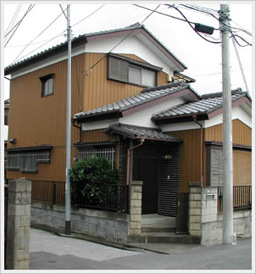
This house is just next door to the homes I pictured in the previous post, and it’s probably my favorite of the homes on our street. I love the terraced effect of the roofs, which seem in harmony to the equally wonderful angled entrance. Our future home should we come to build it (I’ll post more on this later) will sit on a corner property, and I’ve been eyeing this house for inspiration on how to handle that placement. There’s no real functional need (that I can think of) for having the entrance there, but doing so seems to make the house bigger.
Maybe the beauty of this house doesn’t convey well in two dimensions but just looking at this picture enveloped me with dispair . . . that was until I saw the others. Is this really what Japanese vernacular architecture looks like? How can a culture known for its appreciation of beauty create such ugliness?
Or am I missing something?
Phillip, I said it was my favorite of the homes on my (short) street, but not that it was beautiful. And therein lies the rub! That I chose to pin my “favorite” tag on this house I think speaks volumes about what it’s up against (I need to take more photos of the remaining houses on the street and let you compare).