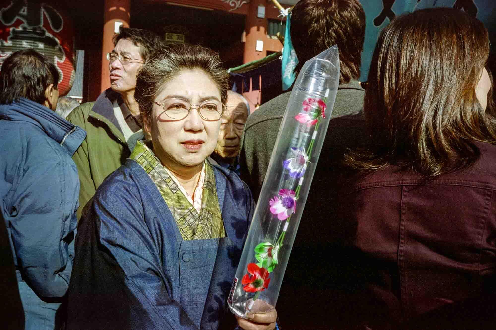

Warabi, Saitama, January 7, 2004. Mamiya 645 Super, Mamiya Sekor 55mm f/2.8, Fuji 160 NPC.
If you took all the girls I knew
When I was single
And brought them all together for one night
I know they’d never match
my sweet imagination
And everything looks worse in black and white
Kodachrome
They give us those nice bright colors
They give us the greens of summers
Makes you think all the world’s a sunny day, Oh yeah
I got a Nikon camera
I love to take a photograph
So mama don’t take my Kodachrome away
— Paul Simon, “Kodachrome”
The other day someone posted to one of the photo-related mailing lists I’m subscribed to that they have been working on a photo series on Japan’s various public housing projects, and said about it,
To underline the hopeless atmosphere over there I started taking photos in black and white. Before I started this project I preferred to take photos in color. [Italics mine].
Now I have not had the fortune or misfortune to live in one of these danchi and so can’t really comment on whether the atmosphere is hopeless or not. I suspect for some it is, for others it is not, though I will go out on a limb here and suggest that if one wanted to look for hopelessness Tokyo’s housing projects would probably not be high on the list when stacked up against those in other parts of the world. (This said, recently our city made national news when a teenage girl committed suicide from the local housing project she lived in, apparently as a result of bullying at school — the same middle school Naoko went to 15 some odd years ago. But whether her living situation contributed to her suicide or was just the convenient means she chose to end her life by, we don’t yet know.)
But my intention isn’t to question the supposed hopelessness of Japan’s housing projects, but rather to draw attention to this particular photographer’s statement that they chose black and white film as a way to “underline” this supposed hopelessness. You hear this kind of thing all the time, folks choosing black and white film because they think it buys them grittier photos, or more life-like photos, or more of a “street” or “documentary” look. These same reasons are also proffered for the digital equivalent — shooting in color then de-saturating in Photoshop or some other photo-editing software — which in my book is far more troubling but I’ll save that rant for another time.
Leaving aside for the moment the question of whether black and white film would in fact make the subject matter seem more hopeless, I wonder what it says about the photographer that they would leave their underlining to their choice of film. In fact, that any underlining is even going on indicates for me a lack of confidence in the actual subject matter, or put another way, perhaps they have realized, albeit subconsciously, that the subject matter isn’t conforming to their preconceived image of it. (Now to be fair I have not seen any of this person’s housing project work — either online or in exhibition — and it may well be that the work transcends the naivete of the artist’s statement, but let’s just say I’m not optimistic it would.)
And what of this idea that black and white film somehow equates with, or at least enhances, feelings of hopelessness? Is that really the case, or more a case of the artist doing a bit of wishful glomming? Would the black and white draw out the supposed misery, or simply place banal but pregnant subject matter in lock step with received notions of how one is meant to understand black and white photos? Taking the reverse tack, would color somehow give the lie to the idea of this place, and make us think “all the world’s a sunny day”? Might we not “get it” (whatever “it” is) and somehow upend the artists best laid schemes?
Again the answers seem to lie within the realm of confidence, the confidence of the artist to let their subjects and subject matter speak for themselves, to tell the stories they’re meant to tell. And perhaps more importantly, the confidence of us as viewers to take in each image on its own terms, and to provide our own underlining, as best as possible unfettered by the handcuffs of the artist on one hand and history on the other, struggling mightily to do the underlining and captioning for us.

