Two to peruse and ponder over

Well, as you can see I’m a busy boy these days, but here are a couple of things to reward those who’ve popped in here of late to find nothing new. I don’t have the time to go into the depth both of these sites deserve, but feel these warrant more than a momentary mention:

Norman Riley

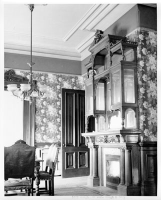
While the site design is very basic and perhaps could be changed to create a more pleasant viewing experience, if one perseveres there is some exquisitely beautiful photography awaiting one at this site by a German-born, Davis, California-based photographer named Norman Riley. Riley currently shoots in large format with a Deardorff 8 x 10 camera, but for now his newer work sans one image has yet to be added to the site.

What is on the site is Riley’s early 35mm “Pictorial” work from 1981 – 85, and what for me forms the heart of the site, four galleries of 4 x 5 work from 1985 – 1998 that Riley calls his “Transitional Images.” As Riley notes on his Technical Notes page: “I refer to my ‘Transitional Images’ as such because, as 4×5 images, they represent the progression from 35 mm to 8×10, and delineate an evolution from providence to proficiency in the art and craft of photography.”

Though in some cases a tad over-sharpened for my tastes, I love the detail and crispness of Riley’s 4 x 5 landscapes, and the wonderful sense of “place-less-ness” they have for me. What I mean is something akin to the word “timelessness,” which unfortunately has become a cliched byword when speaking about black and white work. For me I don’t so much lose a sense of time looking at Riley’s photos as I gain a sense that the places we inhabit and take photos of, should we afford ourselves the chance, are not really so different from one another. Places like Sacramento or Marysville, California for example often fail to excite our visual imagination, but is that a failure of the place or a failure of the eye beholding them?

In a similar vein, there isn’t an apparent heirarchy in what Riley chooses to take photos of, barren landscapes next to views of train stations, architectural details next to stuffed animals in museums, etc., and this democratic quality, in conjunction with a consistent workflow (almost exclusively, Riley’s 4 x 5 images were shot on the same AgfaPan 100 film stock and developed in the same PMK formula) helps to remove the photos from stylistic or genre conventions (read: limitations) and perhaps perversely, lets the images stand on their own, to be judged on their own. There’s an openess to them that defies categorization (eg. “landscape photos”).

I urge you to watch out for those photos where Riley has provided some additional commentary beyond the technical notes of the photo. Sometimes quoting from diary entries written contemporaneously with the shooting of the photo, other times recollecting details about the shoot or the place photographed, Riley’s captions help create an intimacy as if you and he were sitting side by side flipping through one of his albums of photos.

I don’t know where Riley’s 8 x 10 work is going and the one image on the site from this newer work doesn’t tell much of a story, but I certainly will be returning to see how these manifest themselves and flesh out his journey “from providence to proficiency.” No doubt Riley is taking his time, reflecting on his path in the same way his photos reflect on their vistas. As Riley himself explains it:

I feel obliged to disclose that for a considerable time after 1998, I did not practice photography to any regular extent. Rather, I spent many months reflecting on my accomplishments and monumental failures in the medium up to that point, and contemplated qualities I would strive for in my new photographs when I reached the proper frame of mind to resume the practice of photography. For reasons that will be understood by all large format photographers, I spent many hours viewing my images (and those of other photographers and painters) up-side down.

Frank Horvat

Though I’ve seen the name before in passing, on books in the store and what-not, I have been heretofore unaquainted with the work of European photographer Frank Horvat. But thanks to his wonderfully extensive site I came across the other night, that is no longer the case.

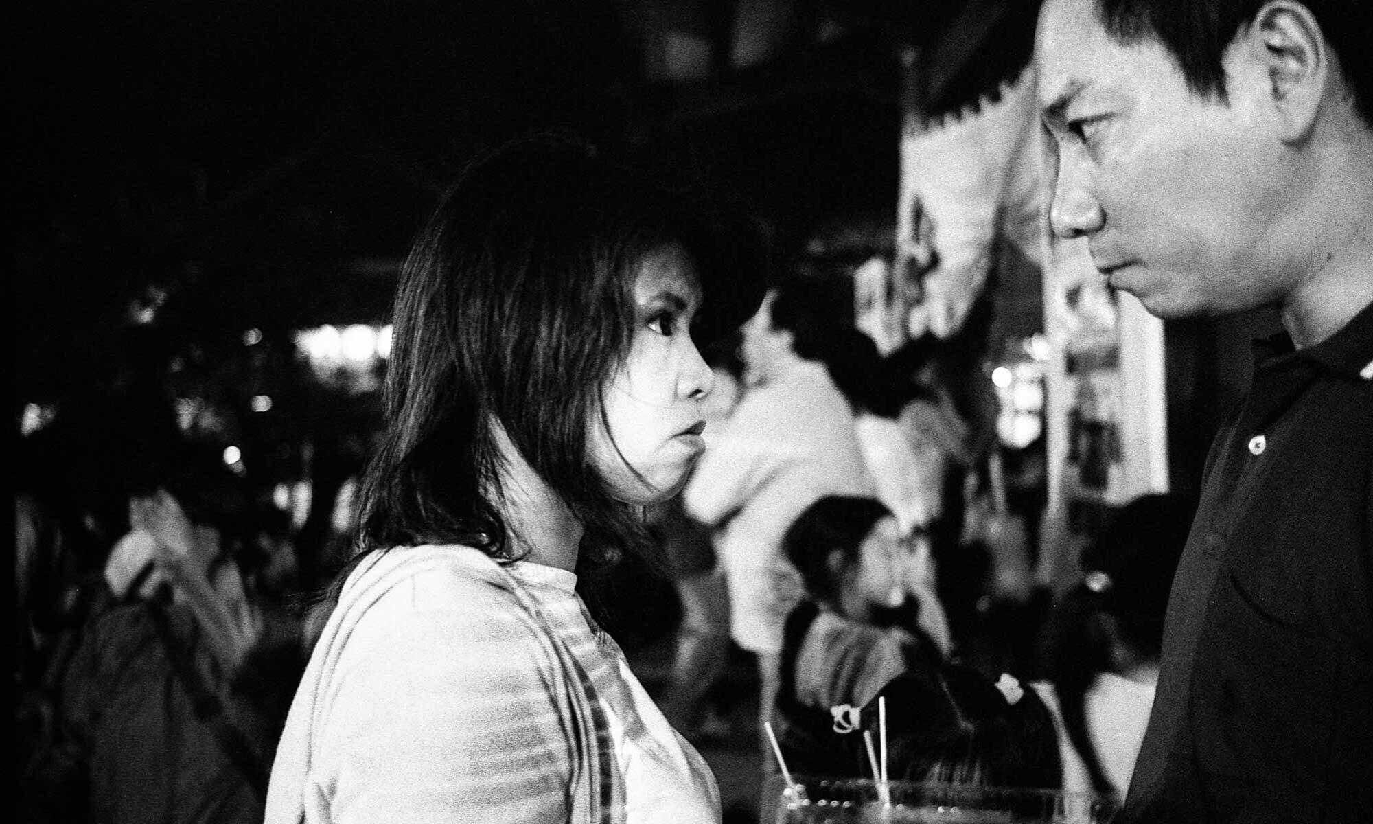
A few things strike one immediately about Horvat’s site: first, there are a lot of images (a rough count comes up with something like 45 different galleries of dare I say near 750 photos); secondly, Horvat doesn’t skimp when presenting these, with most photos measuring 550 pixels at their longest length; third, Horvat has extensively annotated the photos with captions and provided substantial introductory essays for each gallery. These are all features one usually finds lacking in sites from published photographers. (I also note happily that there isn’t an obnoxious copyright notice slapped across any of the photos).

I naturally gravitated towards Horvat’s early black and white documentary work (Paris 1951 – 60 would be a good place to start), but even something as seemingly banal as Animals 1952 – I found thought-provoking. A pleasant surprise for me were the many galleries of fashion photography, not something I would normally give more than half a glance to (Fashion for Harper’s Bazaar 1961 – 66 I found especially nice). And I would be remiss if I didn’t urge you to take a look at his Portraits 1944 – (as with all the galleries, mouse over the question mark icon for information on the who’s and where’s of each photo). On the other hand, I didn’t care for Horvat’s other portrait series Very Similar 1980 – 86 at all.

See 1999, A Daily Report for Horvat’s nascent photoblog: one photo a day (and sometimes two) for every day of the last year of the millenium. Here the different strands of Horvat’s work, with a strong accent on portraiture, come together to give us a picture of his life and encounters during a single year. This is not something that artists usually let us look in on, unless it forms the raison d’être of their work.

Lastly, while certainly Horvat’s photographs are the site, what really tops it off for me is not imagery but some text. From 1983 – 87, a time when Horvat was suffering from “serious problems” with his eyesight, he conducted interviews with 14 photographers, and these were collected and published in the 1990 book “Etre Vues,” in French. An English edition never was published, nor was the French one ever reprinted after it sold out.

So in 2002, Horvat decided to publish the interviews on his site, did some of the translating himself, and even put out a call for someone to help him translate the non-English interviews into English, to which a comparative literature professor in America responded with several French-to-English translations. The end result of all this is that on the site Horvat has now re-published 12 or the 14 original interviews, with eight of these available in English versions, including interviews with Josef Koudelka, Helmut Newton, and Joel Peter Witkin. If you’re blessed with French or Italian ability, other interviews include Robert Doisneau, Marc Riboud, and the Japanese photographer Hiroshi Hamaya.

This is really an invaluable service to those who want to know more about the photographers in question or further understand the motivations and modus operandi of working visual artists, and Horvat is to be applauded for making these available to the commons for free.
Seeing history in Kodachrome — the color slides of Charles W. Cushman

Copyright Indiana Univ.: click for image record at Cushman Photograph Collection

I’ve been wanting to mention this on here ever since I caught wind of it a couple of weeks ago via Consumptive, but felt like it deserved a bit more of a plug than a link in the sidebar:

Charles W. Cushman Photograph Collection

Charles Weever Cushman, amateur photographer and Indiana University alumnus, bequeathed approximately 14,500 Kodachrome color slides to his alma mater. The photographs in this collection bridge a thirty-two year span from 1938 to 1969, during which time he extensively documented the United States as well as other countries.

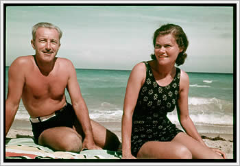
Cushman, shown above in a color-restored 1939 photo with his wife on a beach in Florida, was something of a mystery. For much of his adult life, not much is known about how he lived, other than that he took a lot of pictures with his Contax IIA rangefinder and 50/1.5 Zeiss Sonnar, almost all of them Kodachrome slide transparencies, with very detailed notes as to what he photographed as well as other data like shutter speed and f.stop. He was extremely well-traveled, and the collection, however you want to slice and view it (and the website provides ample ways, with more due in Spring of 2004), is nothing short of amazing.

While Cushman managed to visit and photograph over 45 U.S. states during his life (not to mention 17 foreign countries, including Syria and Lebanon), the heart of his collection can be centered on the 1,200-plus photos of Chicago, where he lived off and on from roughly 1919 to the early 50’s, and on his 1,700-plus photos from San Francisco, where Cushman lived from the early 50’s until his death in 1972, although the quantity of his photos from there before this time period indicate that he was a frequent visitor to the city before actually residing there.

I haven’t yet had the chance to wade through much of his Chicago photos (conversely I have spent several hours going through his photos of San Francisco), but it’s apparent that there is almost an Atget-like obsessiveness to the way Cushman documented the buildings and mansions and slums of Chicago (see Rich Remsberg’s essay “Color Film and Curiosity: Charles Cushman in Photographic Context” for an interesting examination of Cushman vis-a-vis Atget and other documentarians like Riis or Stryker).

The San Francisco photos, on the other hand, probably as a result of a change in Cushman’s station in life, tend to present a postcard image of the city that, while lush and redolent of the vistas one associates with that city by the bay, is not necessarily very striking, as Eric Sandweiss points out in his introductory essay, “Charles Cushman’s Journey through the American Landscape, 1938-1969”:

[…] just as each of Cushman’s many San Francisco panoramas reveals little in the way of the close detail of neighborhood life as we see it in [his] Chicago [photos], they are equally underwhelming, taken as a group, as documents of urban change over time.[…] A different view of things might have been generated by a walk through the Western Addition, or the Mission, or South of Market�all neighborhoods that knew their share of poverty and that stood to be changed, to a greater or lesser degree, by urban renewal programs. Cushman either avoided or simply did not photograph these and other ordinary San Francisco neighborhoods from the same sidewalk perspective that he had favored in Chicago.

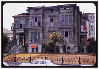
Nevertheless, if one digs a bit deeper and looks at Cushman’s photos on a per roll basis (when on any given image in the collection, you can click on the “Roll No.” link to view all images shot on that particular roll), one can continue to see how Cushman’s documentarian impulse remained even in his less gritty San Francisco days. Take for example his roll 14-59 from the summer of 1959, from which comes this image:

Copyright Indiana Univ.: click for image record at Cushman Photograph Collection

This is the Henry Fortmann mansion on the corner of Eddy and Gough Streets in the Western Addition part of San Francisco. For those like me who are overly fond of Alfred Hitchcock’s San Francisco-set 1958 film Vertigo, this home and its “Eddy and Gough” location is instantly recognizable as the stand-in for that movie’s McKittrick Hotel. I chose this particular picture because the car that is visible in the photo is parked in more of less the same spot (between two cars no less) that James Stewart parks his character’s car in the movie. (See here, here, and here to know that I’m not alone in the obsessiveness with which I recognize these details.)

On it’s own, a not terribly interesting photo of a mysterious but rundown home. But viewed within the context of the entire roll from which it comes, we learn that Cushman took no less than 8 shots of the structure on July 26, 1959, and that he actually came back to the same location about a week later to get an additional shot of the home when the weather was sunny. We also learn, through
his meticulous notekeeping, that the house had been recently damaged by a fire, and was apparently slated for demolition when he took these shots (his notebook page is headed “San Francisco: Demolition in Western Addition. July 26, 1959”). Furthermore, he provides us with a single tantilizing glimpse of the interior of the mansion to indeed document that the building is damaged. Perhaps he just stuck his camera through one of the windows, but I’d like to think he actually entered the condemned structure to snap this one interior image. (The images of the Fortmann mansion are not the only evidence that Cushman was concerned about the changing landscape of San Francisco. See rolls 24-64 and 25-64 for a series of images Cushman took in 1964 of the demolition of the original Palace of Fine Arts, ironically yet another San Francisco landmark that features in Vertigo.)

Up till now the only references I’ve seen to this mansion’s demise have been vague mentions of it being “long-since demolished,” but here, through the ostensibly vernacular pictures of an amateur photographer, we have conceivably some of the last extant images of the structure before it met the wrecking ball. By way of comparison, the San Francisco Public Library’s Historical Photograph Collection has a folder of images of the same mansion, all but one undated. We are able to see the mansion in its former glory, but with precious little context in which to locate what we’re seeing other than some vague ethereal concept of “historical”. (Incredibly enough, one of the Historical Photograph Collection’s images is of the exact same view as Cushman’s burned out interior shot mentioned above!)

One could argue that part of the reason the “historical” photographs fail to resonate is that they are written in a language we already know how to read and interpret, a language that doesn’t challenge our preconceived notions of what constitutes history; that is to say they are written in black and white, literally. To my mind, much of the power behind the detailed documentarian nature of Cushman’s photos is the unremitting color of the Kodachrome. One is simply not conditioned to see much of Cushman’s views, especially those “street” type images from Chicago, or the various urban architecture he documented, in such vivid color. As Remsberg writes in his essay,

An interesting comparison is Cushman’s color images of Chicago in the late 1930s and early 1940s with the black-and-white images of the same city — sometimes the same neighborhoods — made by the Farm Security Administration (FSA) photographers around the same time. Many of their subjects are the same: African-American neighborhoods, “Gypsies,” slums, railroads, Maxwell Street. Both bodies of work are photographically excellent and historically important. It would be difficult — and pointless — to say which is better, but the difference in the emotional response and sense of connection for those of us seeing Cushman’s color slides in the early twenty-first century is powerful and a very different experience than seeing black and white pictures of similar situations.

Cushman did leave more than 2,200 black and white images — most of them taken before World War II — and these are in Indiana University’s possession and will be digitalized by the IU Archives at a later date. For the moment a sampling of these is on view, and while they are certainly of interest, I can’t help but think that their power, as well as their historical import, will not match up to Cushman’s nearly 15,000 color slides.

In the meantime, I would urge you to explore the collection, and to make your own journey through what Cushman has bequeathed to us. Cushman’s photos are not simply the product of a man of means with a nice camera traveling to nice places and photographing nice views. He may have been an amateur photographer, but he was a good one, and much of his subject matter, and the attention to detail with which he pursued his craft, belies the “naive” label normally tagged onto those working on the outside of — indeed, oblivious to — the accepted canons of codified creativity. Indeed, I suspect that on some level, Cushman had an inkling that he was doing something important, something lasting, something destined to be looked at and admired and even studied, many years after he stopped taking his color photos.

One more cross-processed Lubitel

Canterbury, Kent, UK, October 1998: click for larger image (72K)

Canterbury, Kent, UK, October 1998. Lubitel 166U, Fujichrome 64T cross-processed as color negative.

I’s not really noticeable in these jpegs (click above for a larger one), but for some reason these cross-processed images have wonderful grain, which I find more interesting that the color shifts. If I were to do this again, that’s probably what I’d go after.