
Thanks to everyone for taking the time to comment on my previous post, wherein I proffered up two versions of the same photograph — my father-in-law holding my son Kaika — and solicited opinions as to which one was better. The replies were well-considered, and helpful for me in clarifying my own thoughts about them.
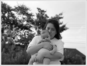
Nearly 24 hours later, my own personal feelings are leaning towards the top picture, which is against the prevailing (and overwhelming) trend in the comments that says that the closely-cropped version is the better photo.
Here’s why: There’s just something a bit too “arty” and pretentious for me in the second pic, for starters. The closely cropped second photo reminds me uncomfortably of those postcards and posters one can see for sale at trendy “art” shops, with the beefy ultra-masculine male model holding a baby. Sort of a Calvin Klein aesthetic if you will.
I suppose part of my problem too is knowing that I Photoshop’ed out that fence behind my father-in-law visible in the larger picture. It’s not a terribly awful Photoshop job, and without the original pic you probably wouldn’t be able to catch it, but I know I did it and for some reason that bugs me. Mind you, I often remove various “unwanted” things from my pictures, bright highlights, assorted oddities that detract from the photos, but for some reason I view this removal as different. Again, I think it has something to do with trying to create a separation or silhouette of the two figures, isolating them in space, which in the end just strikes me as contrived and not genuine. I have this feeling that 10 years from now the bottom pic would embarrass me, in the same way that my old “art school” work often embarrasses me.
On the positive side, re: the top photo, I like the sense that these two people are part of a larger happening, a happening that in its own right is mysterious and vague, with shadowy figures in the background, themselves engaged in their own happening. There is also, as was alluded to in the one comment that voted for this photo, an interesting thing happening in the photo for me with what filmmakers sometimes refer to as “off-screen” space. Both sets of people in the background are looking towards areas beyond the frame, and as such I think that highlights the fact that both my father-in-law and Kaika are also looking into their own “space.” Their lines of sight play in a nice way with the lines of my father-in-law’s arm and his tank-top, and that receding fence that I went to so much trouble to remove in the second photo.
Peter, in voting for the bottom photo, wrote that
The focus, simplicity and tones of the bottom picture seperates this picture from place, transcending time, leaving us with a feeling of connection rather than exhaustion….
On the surface I would agree, but now I see that the cropped photo was creating a false sense of itimacy, or connection. The larger full-frame photo shows that in a way, they are not connected so much to each other, but rather to the scene around them, and that they’re not necessarily comfortable in that scene. Though I didn’t really know it at the time I took the picture, nor last night when I posted both photos, I think that is closer to what I was after, and wanted to capture. The feedback helped me to see that. Thanks everyone.
Just so I can get all my “meta” writing about my photographs out of the way in one post….
I finally dug out my medium format camera last week, after about two years on non-use. A test roll was in order, and inevitably the subject matter turned once again to family. I was quite pleased with how some of them turned out, and working with the bigger negative size is truly a pleasure, so I suspect you might be seeing more images from this camera in the future.
You are right – it completely depends what you are going for with the two photos. I prefer the second one myself, because it looks like more of a “portrait” and empahsizes intimacy between grandfather and grandchild. To me the larger shot seems to show their isolation from the rest of the group. But regardless, both are beautiful.
Kurt,
I’m back & glancing over your page I am glad you went for the top one. Would be a real shame to sacrifice the atmosphere around it.
Also great to hear you dug out the 120 camera, I am on it too. I’ll be in touch for our walk soon!
Dirk
Hmm. One of the factors that might have influenced the decision of some of those who left their comments could be the context in which the photographs are presented. Looking at the images online, in the context of a very text heavy page, just tempts to see the images as additions to the text, as illustrations, not as individual pieces of work.
The medium, the screen, the low resolution, they all tempt to pick the cropped version of the photograph. It is a bit like shooting a movie with television in mind. Close crops are preferred because they somehow still carry expression even in the poor resolution of the television screen. (And it is easier to edit scenes in which there are fewer elements which could lead to a time/space disconnect, think “the burning match”.)
The first image is more complex, but it somehow appears to be a grouping of three images. It feels like a triptych. The composition appears almost too balanced, at first. Then there are the two lights on the right hand side… such overpowering elements… the fence looks a bit like an extension of your father’s in law.
The influence of these artefact elements on the composition become very apparent when you remove the recognisable human elements from the image and focus solely on the composition … (hope you don’t mind these illustrations.)
Do you see how overpowering the two lights are? They somehow seem so important…
Let’s look at the same analysis of the cropped version of the image:
The composition study shows that there is a new complexity in the distribution of the elements. The balance of black and white is very harmonious, the two main elements of the image are connected through a dynamic movement, yet they are still very clearly separated from each other. I think you have created a good balance here. The larger figure appears to fade more into the background, the smaller figure appears to be the more glowing element in this composition. Even at this very abstract level it seems possible to understand the interaction here.
I am not sure if you should really compare this shot to those images used and abused in postcards and posters. I think you have managed to create a very powerful image and it works incredibly well on many levels, try looking at some images of old mastes and see how they composed with brightness… I recommend for example Leonardo’s “Madonna of the Yarnwinder”, or even better: Madonna with cat which actually then probably became Madonna with Child.
(Take a look at the light distribution in this painting here)…
The larger version works and will work better if you adjust the brightness levels or the focus on some of the secondary elements.
The cropped version contains enough complexity to survive on its own.
I personally like how the various layers come together in one single shot.
If you read the image in a “western” way from left to right, (which is also encouraged by the brightest elements being on the right hand side,) then it appears as if the child were entering the composition, looking forward, out of the image, beyond the viewer, with very open, bright and reflective eyes, carried, protected by the arm of the old man, who is looking into almost the opposite direction, inside of the image, with eyes hidden in the shadows.
There are so many interesting layers in this image…
Congratulations.
If you want to talk about the technocalities about photograhy that is fine but I think a picture is a picture and the original is the best. Yes, there are pictures you would want to touch up but a picture can say a thousand things. I think the original is best. Why would you take a picture and then think about how you would edit it. It just seems to me like crazinest to the extreme!
There is no such thing as an original picture?
Our reality is the cropped version of what is really there.
I think it is a very natural process to be selective after the image is in the box.
I also do not think that it is a new concept.
: )
I also do not like to talk about technicalities of photography… : )