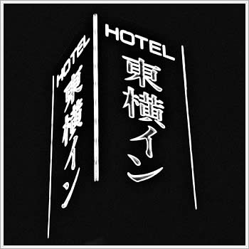
Toyoko Inn, Asakusa Komagata (Tokyo), July 26, 2003. Kodak Tmax 3200. Not a “love hotel,” in case you were wondering.
hmmn: musings from the far east(erwood)
Toyoko Inn, Asakusa Komagata (Tokyo), July 26, 2003. Kodak Tmax 3200. Not a “love hotel,” in case you were wondering.
Comments are closed.
i’m curious whether the translation of the japanese characters here are of significant importance.
Mark-
not particularly, quite prosaic actually. the kanji are as follows:
the first character is either read “tou” or “higashi”, and on it’s own means “east”. It is also the first character of Tokyo (literally, eastern capital). The second character is read either “ou” or “yoko”, meaning “sideways” or side”. It is also the first character for “Yokohama” (literally, “side coast”). The remaining two characters are the katakana (script generally reserved for words derived from other languages) “i” and “n”, hence “in” (“inn”).
from the hotel chain’s website:
“The [Toyoko Inn] group head office is located in Kamata roughly half way between Tokyo and Yokohama where the first Toyoko Inn was opened. In fact the “Toyoko” name is derived from the first kanji characters representing Tokyo and Yokohama respectively.”
I should have added that this combining of the parts of name kanji is quite common here, especially with respect to Train Lines (in fact, there is a “Toyoko Line”). My line, Saikyou Line, is a combination of “sai” from “Saitama” (our prefecture), and “kyou” from “Tokyo”.
i’m sorry if i was being to subtle in my comment. i was making an inside reference to the title of a motel film you made over a decade ago. what struck me most about that film, when i included it in a film program at the robert beck memorial cinema in new york (1999?,) was the framing and use of the strong calligraphic imagery of the capri motel’s neon signs. your recent photograph reminded me of that. in this picture i like the way the three rigid vertical lines and static english letters contain the more expressive japanese characters on three sides.