The following were the photos that were submitted for the current Street Photography Mailing List Salon (due May 10) which I had the good fortune to adjudicate after winning the last one. This Salon’s theme was “engagement,” to be interpreted as the entrants saw fit. What follows is commentary on each photo submitted (if you want to cut to the chase so to speak and see which entry “won,” then scroll to the end of this post). You can find the Street Photography list here.
Without further adieu, here were the entries submitted (click on the photographer’s name for their photo — links will open in new windows):
With the theme in mind I’m thinking concert engagement, etc. The limo is at the center of this image (literally and figuratively) and with the light as it is the limo seems to glow appropriately, like it’s heralding the Second Coming (or only slightly less sacredly, perhaps Jennifer Lopez :). The sunlight paths leading from the limo towards us make me think of the proverbial red carpet treatment. And there’s something intriguing about what looks like the back alley and hotel back entrance. The problem I have with the image is that it seems to be all about the limo, and while it does set the imagination working a bit, the lack of involvement of the other folks in the photo nips my imaginary trail of thought in the bud before it can really get going. The furthest left figure may or may not be heading toward the limo, but the others certainly seem to have nothing to do with it.
Heh, this is interesting. First gut thought is Meatyard. It has the feel of a posed shot and this I like. The kid I swear I can’t tell if he’s human or not, or perhaps wearing a mask, nor can I be sure either about the two adults (hence the Meatyard thought). I love the antebellum look of the porch and that leads to another thought: my beloved Tennessee Williams. The generational thing helps there too. I think engaged as in a discussion, or perhaps argument, or one person trying to engage (the man), another trying to disengage (the woman), and a third (the boy) perhaps waiting it out, he’s heard it all before.
I notice the tilting perspective first, and feel the girl is about to tumble off the platter someone is holding not quite level. Maybe that person whose shadow I can see, whom I suspect is the photographer. I can’t be sure, but the girl seems to be looking at me (the camera), but as the shadow head is a bit off to the right of center, this connects with the tilt for me and I feel further unease. All good. The two folks in the back take the edge off a bit for me, they’re too small for starters and they seem comfortable just sitting there, while perhaps one of their charges (the girl) is headed for parts unknown. I suppose graphically they help to balance the pic, so all is not lost. Love the steps at left. The more or less desolate piazza reminds me in a good way of De Chirico.
The first thing I notice is the quality, for better or worse. I think video still, then perhaps cellphone camera. I fight past that, I’ve already counseled myself that anything goes, no auto points reduction for submitting a bad scan or a low-rez photo. I’m not a big fan of works that derive a big part of their meaning from the words and images that were created by someone else, invariably ad-men and women — and I can’t help that part of the “hit” here is the “Forever?” visible in the mag ad or story. The problem here besides the co-opted advertising is that the woman is cut off from us, it may just be she saw you and was avoiding having her photo taken. Of I can infer she was thoroughly engaged in the article.
This reminds me of Sonny’s is my first reaction. A cantankerous older person perhaps haranguing a young person. The framing however seems claustrophobic to me, but that’s not necessarily a bad thing of course. But given her arm position, and the clasped hands of the younger woman, her cigarette ashes ready to take a tumble, I want to see the older woman’s other hand, for starters. The younger woman’s closed eyes and laugh in a way signal disengagement, like Sonny’s kid she’s heard this all before, it’s a tired old song. I do like the use of color in this one though.
The grit of this one strikes me first. The woman seems like one of those “statues” that play for coins on the streets, you know the guys who are spray-painted silver or gold and don’t move. Perhaps she was caught in a sneeze, or she’s contemplating if one’s skirt can actually billow up if they stand on a subway grate a la Marilyn Monroe. She seems on the precipice of something, whether the grate or a life decision. Perhaps she’s about to click those heels. The heels, the white dots on the dress, that handbag the strap of which seems to be made of yarn, bespeak fragility, gentility….if I may be permitted another Tennessee Williams allusion, she reminds me of Blanche DuBois, ill-equipped to deal with the brutality of the world or city in this instance (my original idea for a Salon theme was “Sometimes there’s God so quickly” which is a Blanche line from “A Streetcar Named Desire”). That wire tracing its way behind her is ominous. Contender.
Whatever news the Hamilton Spectator saw fit to print on this day was captivating for this fellow (or is he just looking at the free rag stand next door?), and unlike a previous photo where I could only imagine a reader engaged with media, here it is more palpable. But there’s still something a bit flat or uninteresting about the photo for me that I can’t quite put my finger on. I do like the play on “spectator” that’s happening, but perhaps the photo would have been more compelling if the subject weren’t so front and center, or if there was greater lack of DOF to bring him a bit out of the monotonous surroundings.
Here too the (main) subject is front and center, but this time looking at us and definitely engaging the photographer. But is he angry or just hamming it up for the camera I don’t know, despite what looks to be a protest. I tend to think the latter, which isn’t a fault of the photo but of simply too many similar photos in my negs, photos you almost feel obliged to take. At any rate, if he’s angry it ain’t at you, and his peace sign follows a line from the “peace” banner carried by the guy next to him. The guy with the mic far right is intriguing, and looking closer I notice that the peace sign guy looks to be holding a P&S digital camera around his neck. So there’s some thoughts engendered in my head about the inefficacy and indeed vacuity of current protest movements, but methinks that probably wasn’t what you had in mind with this photo.
My first thought is a receptionist out on her lunchbreak who forgot to take her switchboard headphones off. I think I did that once of twice myself in a previous life as an office drone. Of course it may be the latest mobile phone accoutrement. Or, she’s a secret service agent. She may or may not actually be talking to someone, it could well be that the line is engaged. Ouch. There’s something interesting about the placement of her in the frame vis a vis the tall buildings, but then again the extended DOF mitigates this a bit, and I start to think about Boston, old buildings vs. new, etc., and I become less engaged.
I must say I didn’t quite know what to make of this one when I opened it up, which is one of the nice things about this Salon thingy….each photo is a surprise. That said, this doesnt seem to be an especially striking image once past the pleasant shock of so many Sikh turbans in the shadow of Abe Lincoln (?). The boy with the sword-like thrust of the stick is the most interesting aspect, especially as he’s nicely framed by the women behind him (mother, sister?) looking in opposite directions, but he is a bit visually overshadowed by the boy with the drum, though as the latter is caught at a moment of closing his eyes, he isn’t very engaging.
Yet another person reading, and with that hair and frock-like garment I can’t help but think Emily Dickinson. Certainly the texture of the photo takes me back far as well. I like what seems to be happening with the various straight lines in the photo, the rectangles of the table and menus, the part of her hair, and the sill-like piping (?) behind her, contrasted with the curve of the chair back, her glass, and her shoulders. Actually, her shoulders seem a bit tensed up, and this leads me to an interesting (to me anyway) observation that she seems to be holding the book rather forcefully, yet as we follow to her other hand, her hold on that cigarette seems nonchalant.
Another protest shot. Similar to Russ-QLP’s women in pub shot, there’s something in the tone of the photo that makes this seem from another time, if only briefly. I don’t notice the hand outstretched right away, I start rather from the policeman’s (?) gaze. He may well be looking at the hand, as if the gesticulating protester is drawing him a map in the air. Further reflection makes me think that the hand is keeping someone at bay, perhaps not physically but rather verbally, some opposing view. There is a nice triangle formed with their eyes and the outstretched arm.
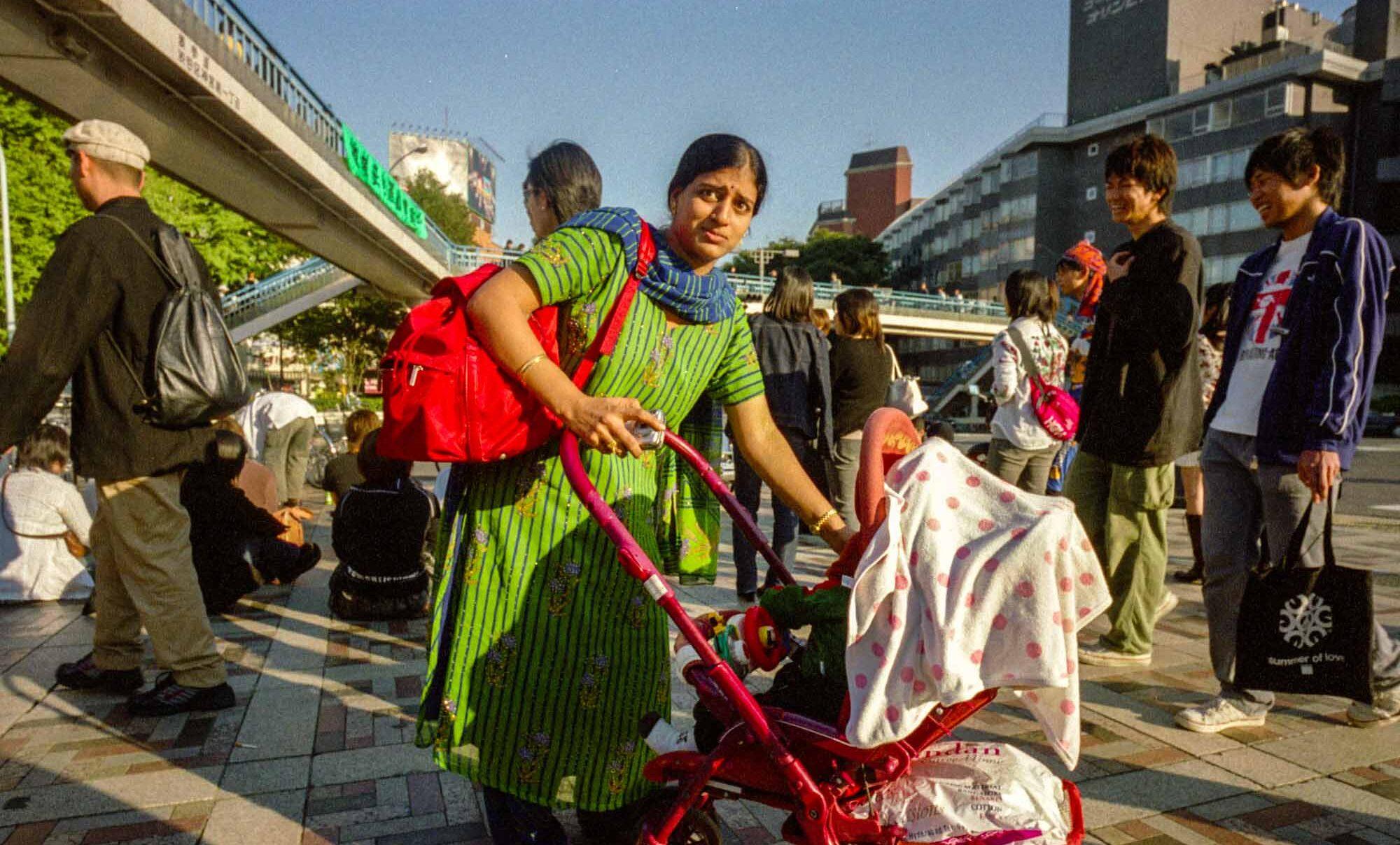
My first thought is that that’s a lot of unoccupied urban space for Tokyo. The truck so big and taking up a lot of that foreground space reminds me of Hiroshige’s 100 Views of Edo series. The way he’s been caught in between the truck and its mirror is intriguing, in a way trapping him there although there’s so many places he could roam. Of course what’s really keeping him there, momentarily no doubt but could be an eternity, is his intereraction with you. You’re important enough for him to stop lighting his cigarette, assess how he’s going to deal with this intrusion into his cognitive space he wasn’t expecting. So in a way, emotionally he also has no ability to roam. Cognitive dissonance. Contender.
Hah! I was waiting for the wedding photos, but this isn’t what I had in mind. Excellent. Yet another person trapped, by horses, by a posse of men in cowboy hats, by the thought of what he’s about to do. His tuxedo can’t help but say urbanity, and with his longish hair and somewhat wan expression, contrasted with the smiles on some of the men on horses, and his diminutive stature, he’s separated or cut-off even as he’s in the middle of the group. I’m sure it’s all innocuous but little matter, there’s a nice balance of mundane and absurd, of lightheartedness and tension. Contender.
Ah, I’ve seen this one before. It’s probably not a protest but I think my gut reaction is I see any kind of topical text (be it “Aristide” or “same sex marriage”) and my knee starts to jerk a little. I like that it’s not really clear where the story is here, is what’s happening in the background, obscured though it is, more interesting than what’s happening in the foreground, cut off as it is. The two vie for attention. The figure foreground right is disturbing to me, being cut off, slightly out of focus, but also weirdly short in relation to the man to the right, as if he’s a midget. His backback strap and bandana around his neck seem too tight as if they’re strangling him. This thought leads me back to the dog and being tethered, to fashion, to old ways of doing things.
What the hell is that white line is my first thought. A new copyright notice? It’s hard to get past it, and then I wonder if I’m supposed to. At any rate, that aside, the image feels too dark to me, it’s hard to get into. I like the way the man is holding that table, like a shield (although the laser beam seems to be getting past it!), and especially its shadow lower right corner, which makes it look like a four-legged creature and so therefore I have a humorous image that it’s not a table at all but some animal kicking and screaming. Ah, back to that line, can’t avoid it: here’s a random guess, you looked at the negative, wrote off this picture, and took a black sharpie to the neg and x’ed it out so to speak.
I don’t mind photos of overweight folks per se, but I have to admit that photos of these people eating is not something I’m particularly fond of. No matter what’s going on in the photo, what’s to like about expressions and and composition etc. it all seems lessened by what amounts to an easy joke, or easy condemnation. I think it’s hard to get around this. So, that bias admitted, I like the way the couple is almost perfectly balanced (both smiling, identical food in their hands, almost the same shape and indeed almost the same hair), and there’s a real sense of conversation, or mutual togetherness, and enough of their expressions to feel this. However, because of this the guy far left with his back to us is bothersome for me. He could make his own statement, given that he’s obviously in good shape, younger, and turning his back on these folks, but as he’s cropped off I’m inclined to think he was just someone in the background captured unwittingly.
I would have preferred not to have a caption to tell me what was going on, and tried my darndest not to read it but alas I did. (On the obvious scale, negative points for using the Salon theme in the caption 🙂 ). I strongly doubt I would have figured out what was going on in the photo otherwise and that would have been fun for me. My first thought would have been studying, or a very dark library, someone burning the midnight oil, and the light makes me think of Caravaggio. There’s a nice balance between the darkness and what we can see, and although the figure is dead center, the way her arms and gaze sway to the left push the viewer’s attention that way.
Interesting, I never would have expected this many photos of folks reading. Quite similar in some ways to Russ-QLP’s photo, the lines, the glass on the table, the hand evidencing some tension yet in a moment of repose. I would have preferred to have less of the barrier on the bottom and more of his head, but it wasn’t to be and it’s not a big problem. I like that the sign is out of focus and I can’t read it, if there’s been a feeling running through me as I make me way through the entries it’s that hasn’t been much play with focus and that sometimes having such an extended DOF has worked to the detriment of the photos. The tones are very pleasing here, I love the way his shirt is rendered.
Wow, love the largeness of this image online, and a very nice use of the square frame. Interesting thing happens in the browser window, as one scrolls down to see the rest of the image, the folks lying down on the benches seem to be levitating. And oh, another person reading! (In case it’s not obvious, I’m writing each photo commentary as I go through the photos, rather than looking at all of them and then writing about each). But this person almost looks like she too was lying down, and has just risen from her slumber. The two others could well be the same person. More nice stuff with the lines or the horizon and the slight angle of the boardwalk. The lamppost seems perfectly placed, both horizontally and vertically, and yet the dangling piece adds some tension. Contender.
Seems very boring and uninteresting on first glance but look again and I begin to scratch my head. Past the banality I notice the skid marks, and then the sign which seems to be missing one of its legs. But it seems such a clean cut I think for an instance, Photoshop job. I wonder what happened so that the rest of the sign was left intact (and also what decision was made to leave the sign there as is). I don’t know how long these skid marks would last on the ground, but they seem “fresh” as it were and so the absence of cars or people is a bit disturbing, and for a moment I flash onto Close Encounters of a Third Kind. I guess the easy joke here is that the car brakes engaged. A sleeper of a pic, I like that.
This is interesting to me given the discussion recently about this kind of stuff. That said, it isn’t the most compelling example I’ve seen. I like the idea of directions in this one though, the man looking the same way you’re going, the other two women looking the opposite way, no doubt somewhat hopefully for the bus to arrive, which will of course eventually take them in the same direction as you. I would have preferred more of the far-right woman, but then maybe the composition would have been too perfect. I also like the way this man is clasping at his shirt.
Hmmn, another intriguing square composition. Not a lot for me to go on however, especially anything vaguely SP in nature, but let’s forge on. I’m assuming it’s a ceiling of some sort, but I’m not 100% sure and that I like. Again, nice stuff going on with lines and how you’ve captured it (or cropped it) it has a nice balance to it. The four lights don’t feel extraneous, and they add a bit of a rounded and random element to the photo which helps to take the edge off.
Oh yeah, this I can tell I’m going to like at first blush. Probably an argument, a lover’s spat perhaps. Although one can’t see as much of the male’s face, he seems to be more strongly represented, and his expression is easy to read. The pointed finger helps here, but so too does the fact that he’s in focus, sharp. She on the other hand, her blurred hand caught in the point or answering his accusatory finger, almost a fist, her soft (as in focus) face vulnerable and hurt, seems to be losing whatever argument they’re having. And yet there’s a nice tension, her clothing is more “tough” in a way, and with that bandana and the cigarette in her hand this contrasts nicely with the man’s turtleneck sweater, which seems so warm and comforting. Here I like the darkness, the lights in the back signal that evening is approaching or already here. Contender.
Hmmn, shopping for an engagement ring at a flea market, sounds like something I’d do. I like the looks of the five people (well, four and a half 🙂 on the left hand side of the frame, in a way mocked by the turned heads and backs of the people on the right hand side, who have already moved on to other wares. There’s something very similar in the way the couple look, like they were made for each other. The trophies in the next stall are somehow passing judgement over the situation, the one that looks like an Oscar reject even seems to have its hand over its mouth.
Ah, the first one with this sort of take on “engagement” if we don’t include the little Sikh boy with his makeshift sword. I’m sure it’s all friendly and cute but the fact that the one who’s standing has seemingly red-tinted fur adds a bit of tension, as does the blurred figure of the aggressor. He/she is definitely cornered, and yet there’s an acceptance of its fate. The stuffed green thing lying dead in the back seems to foretell the outcome of this exchange, as the stocking lower left corner foretells the life awaiting them should they make it out of the kennel alive.
Okay, another in the pub/cafe sub-Salon! The softness works against this picture rather than enhancing it (unlike your last Salon entry which I quite liked), but I understand you were probably working within limitations. There’s a nice gender expectation thing working which reminds me a bit of Alex’s photo: he of the sweater yet with that Guiness pint, she perhaps bigger than he, with a slightly mannish hair cut, but with the wine glass. Maybe this is the prelude to an actual engagement, maybe he’s got a ring in his hand, but my mind doesn’t really go that far. Rather I look to their drinks, hardly sipped from, and I like the idea that the drinks could wait, the kiss was the more pressing need.
Another entry for the protest sub-Salon! (Sorry, you can tell that I’m starting to fade slightly after this many entries). This one I like because you’ve somehow managed to take it out of the “protest” genre such as one exists, in part because you’ve shown something that’s part and parcel of most protests but little shown: the standing around and waiting, or the standing around and listening to shrill speeches, or just the standing (and sitting) around taking a break. (All those legs and feet and the back facing away from the camera incline me to think this is during some harangue). It’s also nice to see the “other side” represented so to speak, even if it’s a side I’m not sympathetic to. I long for just a tad more, perhaps more bored folks in the foreground, or seeing a bit more of the legs faced the other way. The flag in front of the person’s face bothers me too for some reason.
Heh heh, this looks to be taken in my neck of the woods. And it follows along a path I’m been on recently, about cliches and expected views of certain things or places, which actually led me towards choosing the “engagement” theme. So perhaps your ears were burning. While I’m sure that non-Japanese tourists would find these amusing and be happy to pose with them, the writing on them implies that they are mainly for domestic consumption, and this leads me to thoughts about how willing cultures are to adapting to or playing into how they are imagined by others elsewhere. The purple cast bothers me a bit but not terribly so. It does make the “faces” glow a bit, almost beckoningly. Looking again, I notice that perhaps these are at the moment put away, there seems little space for folks to go behind, perhaps it’s still early morning, they will be trudged out later and put in front of a more compelling backdrop. They dutifully wait for their hollowness to be filled, but when it is, will it be more hollow than it was before? Contender.
Okay, I’m doing my darndest not to read the caption (just as I skipped over some discussion of this pic started by Bee). There’s something about this that looks posed though I’m sure it isn’t. Two guys with paunches (I guess as you move up the ranks paunches become more acceptable) having a somewhat animated conversation, or at least the guy on the left is animated. I love the body language of both, especially the guy on the right with his are you out of your fucking mind expression. The guy in the back is trying to remain obvlious to it all, or perhaps appear oblivious as he absorbs the information. I wish the flash or whatever is causing the photos et al on the wall to blow out wouldn’t have done that, I find it intriguing that what must be some outpost in the middle of nowhere looks not too different from some executive’s office back in the states. Okay, I’ve now read the caption, minus points for using “engaged” in it 🙂
Another intriguing shot. This must have been taken (or flipped) upside down me thinks, but it’s not the first thing I’m concerned about so that’s good. Despite being shadows of their selves, there’s an “aliveness” to the two that’s felt by me. And while I can make assumptions about their gender, I like the fact that the focus seems to be more about two people rather than a man and woman. That said, even in shadows, the man has his hands in his pockets, and it’s the woman with her arm extended.
What the hell! Oh okay, I get it….no wait a minute, I don’t. 🙂 Looks to be some Coney Island arm-wrestling thing snuggled up against a photo booth where you can take a photo looking like Dylan Klebold. Or maybe they’re one and the same attraction. Well, nevermind. They’re held together by this guy we can’t really see holding hands with the toughguy. The moll on the right even looks to be getting jealous. Needless to say this wasn’t the kind of arm-wrestling the amusement makers had in mind.
Okay, I think the “conversation” engagement has just overtaken the protest one. The first thing I notice is that painting, which dominates spatially as well as with respect to its color, and the painted cups echo the cups on the table nicely albeit a bit predictably. Here both people seem equally engaged, which is nice, they’re eyes almost on the same level, their hands clasped. OTOH, there’s something a bit disconcerting about the woman on the right, as if she’s about to pounce.
Oh this poor woman is going to get her photos back and wonder who the hell is that behind snoopy’s ears. Actually, there’s something about this that looks like you’ve taken it into a mirror, and that that’s you there. There ears are strangely human, but not human ears but arms, trying to reign in this woman, keep her in his sights. It also looks from this angle that “snoopy” is reared back a little, like he’s shirking a bit from this woman, the limelight. I like the contrast betwen those circles on his head and the pattern on the sidewalk.
Another very nice square composition (all hail the square!), echoing the square “board”. In a way the whole frame seems very “classic”, things seem in their right place (four sides of the frame, four sides of the board, four people in the photo), like the makeshift board which still has lines and squares. The round pieces are like the people, not compeletely random yet not something that can be confined to a square for very long. The man in the middle, with his cigarette and watchful gaze, could in some ways be you.
I can barely see that there are two bikes so there’s something interesting happening in my head about these two people sharing a hug and a bike. The woman in the center seems wistful, probably because she seems a tad soft focus wise, though she could just as well have been irritated by this show of public affection. The husband for his part has chosen to ignore the scene, focusing on his kids and responsibility. It’s interesting to realize that the husband and wife are walking, everyone else in the picture has wheels. I suppose this heightens the idea that in a way their time has past, they are on the other side now, their chances for intimate moments just between the two of them slim or none.
This could be an innocuous customer – clerk situation, or he could be hitting on her, or her boyfriend for all we know. She for her part, in as much as we can tell from our eavesdropping position, doesn’t seem overly interested either way. Then again she’s probably shielding her eyes from the sun. Like the limousine photo way back when, the sunlight seems to be highlighting this couple for our benefit, as if their central position isn’t enough.
My first thought is wow, folks still breakdance. I have to be honest and say I don’t find this a terribly interesting photo. I can understand that this guy must have been moving quite fast for him to be blurred, but then on the other hand the light could have been low and so a blur was inevitable. At any rate it seems accidental, or even incidental. For me there’s also too much uninteresting space to the right. There could have been something interesting with this foreground guy going all out and perhaps the other guy biding his time, or warming up, but only the bare smidgen of that is here for me.
The composition of this is interesting, and one where the longer DOF helps rather than hurts. It makes one wonder if the cruise ship and these two women are connected, perhaps the ship has docked for the day and these women went out to explore the town and are now resting their weary feet. Or perhaps they’re not connected at all. I would have liked to have seen more of their faces, as it is with their hat and scarf they seem a bit like Kevin’s headless photo ops. This looks to have suffered from uneven agitation during development, with the faded sides and line down the middle, which is an unfortunate distraction.
Argh, I forgot not to look at the text on the page and I see the definition. That’s okay, I would have done the same (looked up the word) but perhaps leaving me and others to guess your defintion of choice would have been better presentation wise. But we’re not here to talk about that so….I see a man in a wheelchair next to a dumpster. For better or worse, my first thought is he’s homeless and he’s looking for or has found his next meal. Or perhaps this dumpster, so large and ominous next to him, is his shelter, his protection. The composition is a little awkward for me, the dumpster perhaps occupying too much space, he being pushed out to the edge of the frame. I could make meaning out of that but it would seem forced. I see the beginnings of a nice-looking building/house behind him that might have made things stronger. And perhaps inevitably, but seeing him from behind can only serve to weaken the image IMHO.
Don, you haven’t mucked things up and I’m glad you decided to participate. It’s my age showing but I can’t help think Bad News Bears, I loved that movie when I was a kid. The way the man has elongated his neck makes him look like a big bird rather than coach (the bill of his cap helps here too), and I have no idea how he’s communicating to this kid (angrily, consolingly, questioningly) but one has to feel for the kid, especially the way those two kids to the left are looking (“we’re next!”). Ordinarily I would want to see the kid’s face, but the look on the two others tells me what I want to know, especially that of the kid with glasses. There’s such a great combination of vulnerability and foreboding, yet also silent condemnation and smugness, as he slaps the bat against his hand. Priceless. There’s a nice framing/cropping of the photo, what with the catcher on the left about the toss back to the pitcher. It could have been cheesy, but it works. My only problem with the image is that it seems real soft (could be bad scan?), although with the kid being talked to, it helps give an image of “quaking in his boots”. I really like looking at the four main figures (the kid far right cut off is distracting but not detrimentally so), their heads make such a nice circle. Well done. Contender.
The look between the two main figures is very nice. In a way she could be posing for him as much as for the artist, perhaps it was his idea, he’s going to pay for it. Whatever that is to the left (curtain?) intrigues me, though in this case maybe that’s not a good thing. What I mean is that while I like the interaction of the two people on the other side of the artist, on the whole the photo isn’t very compelling for me. And, as much as I don’t want it to, the nature of the presentation (what looks to be a very bad jpeg conversion) is a real barrier to enjoying the photo.
Oh boy, remind me never ever to win another Salon! I’ve lost track of how many photos were submitted but it must be near 40. I hope I got them all, if I didn’t you can email me and I’ll add it (though it’ll be too late to be declared the “winner”).
I found interesting things to like or think about in just about every photo, though I have to be honest and say very few images stuck with me as I was doing this, images I’d want to return to and look at again and again. That said, I realized through this exercise that there’s something in every photo, and that perhaps sometimes, due to oversaturation, time, laziness, I tend to pass over a lot of things too quickly, make instant editing choices in my head on whether to continue to look or click the little X to close the window. I think I too often err on the side of moving on too quickly, and although this took a hell of a long time for me, I’m glad that it forced me to be patient, to continue to look, and also to move past certain knee-jerk reactions I might have (while not completely dispensing with them, I’m human after all).
For what it’s worth, my original idea for “engagement” was the idea of the photographer engaging his subjects, not shirking away from them, not pretending he/she didn’t exist, but using that relationship of photo-taker and subject-giver to show communication, a sense that they were in this together. But, as I hope is obvious, I threw that idea away before I started to look at your entries. To me it would be silly (and somewhat sadistic) to sit here and see if anyone could hit my own interpretation of the theme. Guess what I’m thinking! No, I wasn’t interested in that.
Just a note on methodology: I commented on each entry one by one, not moving on to the next photo until the bulk of my comments had been written about the previous one. (In some cases I returned to photos and added something, but I didn’t change what I originally wrote). I also made it a point not to delve into the archives of any of the participants, see any other photos they have online, their background, etc. Of course with some I’m already familiar with their work, but I did my best to not let that influence me. And, I haven’t read the SP list the last few days, not wanting to see what others might be commenting about the photos. (I’m not saying this is the way I think it ought to be done, just the way I chose to do it).
My short list of contenders are noted above. I could really pick any of them and feel satisfied. In the end, I’m going with Don Sorsa’s photo. I just can’t get that look on the kid with glasses out of my head. Don, you’re it.
Jim Hurtubise’s limo reminds me of the most recent Don Delillo book (which takes place during one drive across town in a white limo). Not one of Delillo’s best books. And I think this photo might be better than the one they used for the cover (http://images.amazon.com/images/P/0743244249.01.LZZZZZZZ.jpg)
But I think you picked the best one…